8.12.1 Custom color mappings
The default mapping used between values of  and color is a grayscale mapping. This is scaled such that the smallest value of in the map corresponds to black, and largest value corresponds to white.
Alternatively, the user can supply any algebraic expressions for converting values of into colors. Moreover, these custom color mappings need not be one-parameter mappings depending only on a single variable , but can depend on up to four quantities ,  ,
,  and
and  . This makes it possible, for example, to represent both the amplitude and complex phase of a quantity in a single color map.
Pyxplot’s colormap plot style takes between three and seven columns of data, which may be supplied either from one or more function(s), or from a data file. If data is read from a data file, then the first two columns of output data are assumed to contain the respective positions of each datapoint along the  -axis and the
  -axis. The next column contains the value , and may be followed by up to three further optional values , and .
In the case where one or more function(s) are supplied, they are assumed to be functions of both and , and are sampled at a grid of points in the  plane; the first supplied function returns the value , and may be followed by up to three further optional functions for , and ..
The color mapping is set using the set colormap command, which takes an algebraic expression which should be a function of the variables c1, c2, c3 and c4. This should evaluate either to a color object or a number (in which case a color is drawn from the current palette).
set colormap <expr> [ mask <expr> ]
If the optional mask expression is supplied, then any areas in a color map where this expression evaluates to false (e.g. zero) are made transparent. The following color mapping, which is the default, produces a grayscale color mapping of the third column of data supplied to the colormap plot style; further columns of data, if supplied, are not used:
set c1range [*:*] renormalise noreverse
set colormap gray(c1)
The set c<n>range command command specifies how the values of  are processed before being used in the expressions supplied to the set colormap command. It has the following syntax:
set c<n>range [ <range> ]
              [ reversed | noreversed ]
              [ renormalise | norenormalise ]
If the renormalise option is specified, then the values of at each point in the data grid are first scaled into the range zero to one. This is often useful, since the color components passed to the rgb(), gray(), hsb() and cmyk() functions must be in this range. Thus, in the example given above, the lowest value of corresponds to black (i.e. brightness 0), and the highest value corresponds to white (i.e. brightness 1). If an explicit range is specified to the set c<n>range command, then the upper limit of this range maps to the value one, and the lower limit maps to the value zero. An asterisk (*) means that the lowest or highest value found in the map is substituted. The mapping is inverted if the reverse option is specified, such that the upper limit maps to zero, and the lower limit maps to one. Intermediate values are scaled either linearly or logarithmically, and these behaviours can be selected with the following commands:
set logscale c1
set linearscale c1
In the example below, a color map of the function 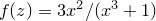 is made, using hue to represent the magnitude of
  and saturation to represent the complex argument of :
set numerics complex
set sample grid 400x400
set nogrid
set size square
set key below
set c1range[0:2]
set colmap hsb(c1,c2*0.7+0.3,1)
f(x) = 3*x**2 / (x**3+1)
plot [-3:3][-3:3] abs(f(x+i*y)):arg(f(x+i*y)) with colormap
![\includegraphics[width=8cm]{examples/eps/ex_branch_cuts}](images/img-0535.png)
In the next example, three circular pools of red, green, and blue illumination are overlapped to show how colors mix together:
set size square
set nokey
set nocolkey
set numeric errors quiet
set noxtics ; set noytics
set axis x invisible
set axis y invisible
d = 0.5
t(x) = max(0,2-exp(x**8))
set colmap rgb(t(hypot(c1 ,c2-d/sqrt(2))), 
t(hypot(c1+d,c2+d )),
t(hypot(c1-d,c2+d )) )
set sample grid 250x250
set c1range norenorm
set c2range norenorm
plot [-1.5:1.5][-1.5:1.5] x:y with colormap
![\includegraphics[width=8cm]{examples/eps/ex_spectrum_colmix1}](images/img-0538.png)
The same is possible with CMYK colors, to demonstrate how substractive color mixing works:
set size square
set nokey
set nocolkey
set numeric errors quiet
set noxtics ; set noytics
set axis x invisible
set axis y invisible
d = 0.5
t(x) = max(0,2-exp(x**8))
set colmap cmyk(t(hypot(c1 ,c2-d/sqrt(2))),
t(hypot(c1+d,c2+d )),
t(hypot(c1-d,c2+d )),
0 )
set sample grid 250x250
set c1range norenorm
set c2range norenorm
plot [-1.5:1.5][-1.5:1.5] x:y with colormap
![\includegraphics[width=8cm]{examples/eps/ex_spectrum_colmix2}](images/img-0541.png)
The function colors.wavelength(wlen,normalisation) provides a color representation of any given wavelength of light, useful for producing representations of the electromagnetic spectrum:
set nokey
set nocolkey
set size ratio 0.2
set noytics
set xlabel ’Wavelength’
set noylabel
set linear x y
set colmap colors.wavelength(c1,1)
set sample grid 200x2
set c1range norenorm
set title ’The electromagnetic spectrum’
plot [unit(350*nm):unit(700*nm)][0:1] x with colormap
![\includegraphics[width=8cm]{examples/eps/ex_spectrum_1}](images/img-0544.png)
The function colors.spectrum(spectrum,normalisation) takes a function as its first input, which should return a spectral energy distribution (in arbitrary units) as a function of wavelength. In this example, we show the colors of blackbodies of different temperatures. We renormalise their brightnesses by  to avoid saturating hot blackbodies to white:
set log x
set linear y
set nokey
set nocolkey
set size ratio 0.2
set noytics
set xlabel ’Temperature’
set noylabel
f(lambda) = phy.Bv(phy.c/lambda,c1) / (c1 / unit(6000*K))**4
set colmap colors.spectrum(f,3e3)
set sample grid 200x2
set c1range norenorm
set title ’Colors of blackbodies of different temperatures’
plot [unit(2000*K):unit(20000*K)] x with colormap
![\includegraphics[width=8cm]{examples/eps/ex_spectrum_bbcol}](images/img-0548.png)
As a final example, we use this function to plot the interference pattern seen when a wedge of stressed plastic, a birefrigent material, is viewed between crossed polars:
set nokey
set nocolkey
set size ratio 0.2
set noytics
set noylabel
spec(wl) = cos(2*pi*c1 / wl) * 1.25
set unit of length nm
set xlabel ’Optical path difference’
set colmap colors.spectrum(spec,1)
set sample grid 400x2
set c1range norenorm
set title ’Colors of a wedge of stressed plastic between crossed polars’
plot [unit(0*m):unit(2e-6*m)][0:1] x with colormap
![\includegraphics[width=8cm]{examples/eps/ex_spectrum_biref}](images/img-0551.png)