8.2.1 Lines and points
The following is a list of Pyxplot’s simplest plot styles, all of which take two columns of input data on 2D plots (three columns on 3D plots), which represent the  -,
-,  - (and
  -)coordinates of the positions of each point:
stars – similar to points, but uses a different set of marker symbols, based on the stars drawn in Johann Bayer’s highly ornate star atlas Uranometria of 1603.
 ) at each datum.
 ) at each datum.
Example: A Hertzsprung-Russell diagram
Hertzsprung-Russell (HR) diagrams are scatter-plots of the luminosities of stars plotted against their colors, on which most normal stars lie along a tight line called the main sequence, whilst unusual classes of stars – giants and dwarfs – can be readily identified on account of their not lying along this main sequence. The principal difficulty in constructing accurate HR diagrams is that the luminosities of stars can only be calculated from their observed brightnesses
  , using the relation
  if their distances
  are known. In this example, we construct an HR diagram using observations made by the European Space Agency’s Hipparcos spacecraft, which accurately measured the distances of over a million stars between 1989 and 1993.
The Hipparcos catalogue can be downloaded for free from ftp://cdsarc.u-strasbg.fr/pub/cats/I/239/hip_main.dat.gz; a description of the catalogue can be found at http://cdsarc.u-strasbg.fr/viz-bin/Cat?I/239. In summary, though the data is arranged in a non-standard format which Pyxplot cannot read without a special input filter, the following Python script generates a text file with four columns containing the magnitudes ,
,  colors and parallaxes
  of the stars, together with the uncertainties in the parallaxes. From these values, the absolute magnitudes
  of the stars – a measure of their luminosities – can be calculated using the expression
 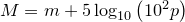 , where is measured in milli-arcseconds:
for line in open("hip_main.dat"):
try:
Vmag = float(line[41:46])
BVcol = float(line[245:251])
parr = float(line[79:86])
parre = float(line[119:125])
print "%s,%s,%s,%s"%(Vmag, BVcol, parr, parre)
except ValueError: pass
The resultant four columns of data can then be plotted in the dots style using the following Pyxplot script. Because the catalogue is very large, and many of the parallax datapoints have large errorbars producing large uncertainties in their vertical positions on the plot, we use the select statement to pick out those datapoints with parallax signal-to-noise ratios of better than 20.
set nokey
set size square
set xlabel ’$B-V$ color’
set ylabel ’Absolute magnitude $M$’
plot [-0.4:2][14:-4] ’hrdiagram.dat.gz’ w d ps 3
![\includegraphics[width=10cm]{examples/eps/ex_hrdiagram}](images/img-0397.png)
Hertzsprung-Russell (HR) diagrams are scatter-plots of the luminosities of stars plotted against their colors, on which most normal stars lie along a tight line called the main sequence, whilst unusual classes of stars – giants and dwarfs – can be readily identified on account of their not lying along this main sequence. The principal difficulty in constructing accurate HR diagrams is that the luminosities
of stars can only be calculated from their observed brightnesses , using the relation if their distances are known. In this example, we construct an HR diagram using observations made by the European Space Agency’s Hipparcos spacecraft, which accurately measured the distances of over a million stars between 1989 and 1993. The Hipparcos catalogue can be downloaded for free from ftp://cdsarc.u-strasbg.fr/pub/cats/I/239/hip_main.dat.gz; a description of the catalogue can be found at http://cdsarc.u-strasbg.fr/viz-bin/Cat?I/239. In summary, though the data is arranged in a non-standard format which Pyxplot cannot read without a special input filter, the following Python script generates a text file with four columns containing the magnitudes
, colors and parallaxes of the stars, together with the uncertainties in the parallaxes. From these values, the absolute magnitudes of the stars – a measure of their luminosities – can be calculated using the expression , where is measured in milli-arcseconds: for line in open("hip_main.dat"):
try:
Vmag = float(line[41:46])
BVcol = float(line[245:251])
parr = float(line[79:86])
parre = float(line[119:125])
print "%s,%s,%s,%s"%(Vmag, BVcol, parr, parre)
except ValueError: pass
The resultant four columns of data can then be plotted in the dots style using the following Pyxplot script. Because the catalogue is very large, and many of the parallax datapoints have large errorbars producing large uncertainties in their vertical positions on the plot, we use the select statement to pick out those datapoints with parallax signal-to-noise ratios of better than 20.
set nokey
set size square
set xlabel ’$B-V$ color’
set ylabel ’Absolute magnitude $M$’
plot [-0.4:2][14:-4] ’hrdiagram.dat.gz’ w d ps 3