Pyxplot |
Examples - Colormap with contours |
Pyxplot is
sponsored and
hosted by

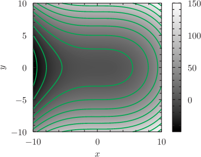
An example of the color map plotting style, with superimposed contours Pyxplot's colormap plot style produces a color representation of how a function varies across the x-y plane, where different colors represent different values of the function. Here a grayscale color map of x^3/20+y^2 is overlaid with contours of the same function plotted using the contours plot style. Script
set xlabel "$x$"
set ylabel "$y$"
set nokey
set size 6 square
set samples grid 400x400
set nogrid
plot [-10:10][-10:10] x**3/20+y**2 with colormap, \
                      x**3/20+y**2 with contours col green lw 2 lt 1
|
