10.14 The piechart command
The piechart command produces piecharts based upon single columns of data read from data files, which are taken to indicate the sizes of the pie wedges. The piechart command has the following syntax:
piechart ('<filename>'|<function>)
     [using <using specifier>]
     [select <select specifier>]
     [index <index specifier>]
     [every <every specifier>]
     [label <auto|key|inside|outside> <label>]
     [format <format string>]
     [with <style> [<style modifier> ... ] ]
Immediately after the piechart keyword, the file (or indeed, function) from which the data is to be taken should be specified; any of the modifiers taken by the plot command – i.e. using, index, etc. – may be used to specify which data from this data file should be used. The label modifier should be used to specify how a name for each pie wedge should be drawn from the data file, and has a similar syntax to the equivalent modifier in the plot command, except that the name string may be prefixed by a keyword to specify how the pie wedge names should be positioned. Four options are available:
auto – specifies that the inside positioning mode should be used on wide pie wedges, and the outside positioning mode should be used on narrow pie wedges. [default]
key – specifies that all of the labels should be arranged in a vertical list to the right-hand side of the piechart.
inside – specifies that the labels should be placed within the pie wedges themselves.
outside – specifies that the labels should be arranged around the circumference of the pie chart.
Having specified a name for each wedge using the label modifier, the format modifier determines the final text which is printed along side each wedge. For example, a wedge with name ‘Europe’ might be labelled as ‘27% Europe’, applying the default format string:
"%.1d\%% %s"%(percentage,label)
Three variables may be used in format strings: label contains the name of the wedge as specified by the label modifier, percentage contains the numerical percentage size of the wedge, and wedgesize contains the absolute unnormalised size of the wedge, as read from the input data file, before the sizes were renormalised to sum to 100%.
The with modifier may be followed by the keywords color, linewidth, style, which all apply to the lines drawn around the circumference of the piechart and between its wedges. The fill color of the wedges themselves are taken sequentially from the current palette, as set by the set palette command. Note that Pyxplot’s default palette is optimised more for producing plots with datasets in different and distinct colors than for producing piecharts in aesthetically pleasing shades, where a little more subtly may be desirable. A suitable call to the set palette command is highly recommended before the piechart command is used.
As with the plot command, the position and size of the piechart are governed by the set origin and set size commands. The former determines where the centre of the piechart is positioned; the latter determines its diameter.
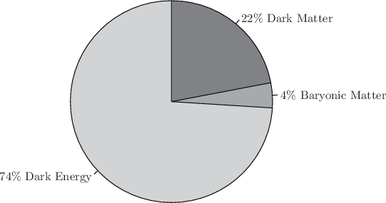
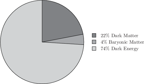
In this example, we use Pyxplot’s piechart command to produce a diagram of the composition of the Universe, showing that of the mass in the Universe, only 4% is in the form of the baryonic matter; of the rest, 22% is in the form of dark matter and 74% in the form of dark energy:
set palette gray40, gray60, gray80
set width 6
piechart ’–’ using $1 label key "%s"%($2)
0.22 Dark
 Matter
0.04 Baryonic
Matter0.74 Dark
EnergyEND
Below, we show the change produced by replacing the line
piechart ’–’ using $1 label key "%s"%($2)
with
piechart ’–’ using $1 label auto "%s"%($2)
Note that the labels on the piechart are placed either within the pie, in the cases of large wedges, and around the edge of the pie for those wedges which are too narrow for this.