Pyxplot |
Examples - Pendulum |
Pyxplot is
sponsored and
hosted by

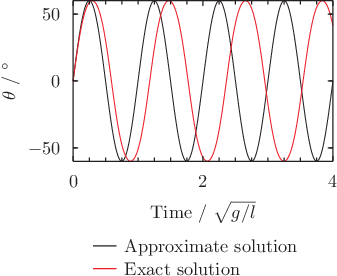
Example plot - the motion of a pendulum In this example application of Pyxplot, we use some of its built-in mathematical functions -- arcsines and Jacobi functions -- to plot the motion of a pendulum which is swinging with an amplitude of 60 degrees. The black lines shows the motion predicted under the assumption of simple harmonic motion, while the red line shows the pendulum's true motion. The small angle approximation is not very good for a pendulum swinging through such a large angle. Script
set unit angle nodimensionless

theta_approx(a,t) = a * sin(2*pi*t)
theta_exact (a,t) = 2*asin(sin(a/2)*jacobi_sn(2*pi*t,sin(a/2)))

set unit of angle degrees
set key below
set xlabel r'Time / $\sqrt{g/l}$'
set ylabel r'$\theta$'
omega = unit(60*deg)
plot [0:4] theta_approx(omega,x) title 'Approximate solution', \
           theta_exact (omega,x) title 'Exact solution'
|
